

The above illustrations are of the beauty products I want to feature in the beauty survival kit. I'm particularly proud of the nail polish bottle as (no pun intended) it looks rather polished and professional.
When I started illustrating the products I intended to illustrate all of them however throughout the process I thought about having illustrations of a few of alternating products, as not to the fill up the page too much with imagery. I want this article to be a double page spread at most and having too many illustrations could make the article appear cramped.
I found it particularly hard to add the typography for the brand logos on the packaging. Instead I'm going to add them digitally which should give them a similar effect to the Sally Cotterill and Judit Mallol illustrations.
The hand written title 'The Art of Vintage' would be nice to use as well.

Above are my experiments for the Fox & Feather article illustrations. For the title page I want to have a hand drawn logo of a fox with two feathers criss crossing underneath. The fox illustrations as pretty straight forward and I was happy on the first attempt! I think it works well as it's simplistic.
I like the physical anatomy of peacock feathers so I experimented with creating illustrations of them to use in the logo. I tried a few attempts of painting it with watercolour however it wasn't sitting right next to the image of the fox. I decided to draw it with a fine liner instead and I much prefer this. It ties the two elements of the fox and feathers together really well. I'm going to digitally copy and paste the feather and arrange the illustration digitally too.
To the side of the image are some "doodles" I will be including in The Blog Space article. I picked out some of the elements from Anna's blog space (shown below) such as the arrows on the "Be You Tiful" sign and created some similar elements. I decided to go for black as there are accents of black in the photograph. I will use Photoshop to intensify the black as at the moment it's a bit "wishy washy".
Below are the illustrations I'm including in the Cry Baby review. The album artwork has a lot childish themes and elements, with clouds and raindrops also featuring a lot. I went for the bow illustration as it's quite innocent and childish which fits with Melanie Martinez's whole aesthetic. It's probably my favourite illustration out of all the illustrations I created and I think it will look great on the corner of an image as if it is "pinning" it to the page.
I created some clouds and tears/raindrops as well. To create them I kept the paints quite watery and added drops of colour whilst the paints were still wet on the page to give a marbled affect. I wanted them to look "wet" as if they are staining the page and I am happy with the results. The purple and bluey tones fit with with the album cover which I have show below for reference.
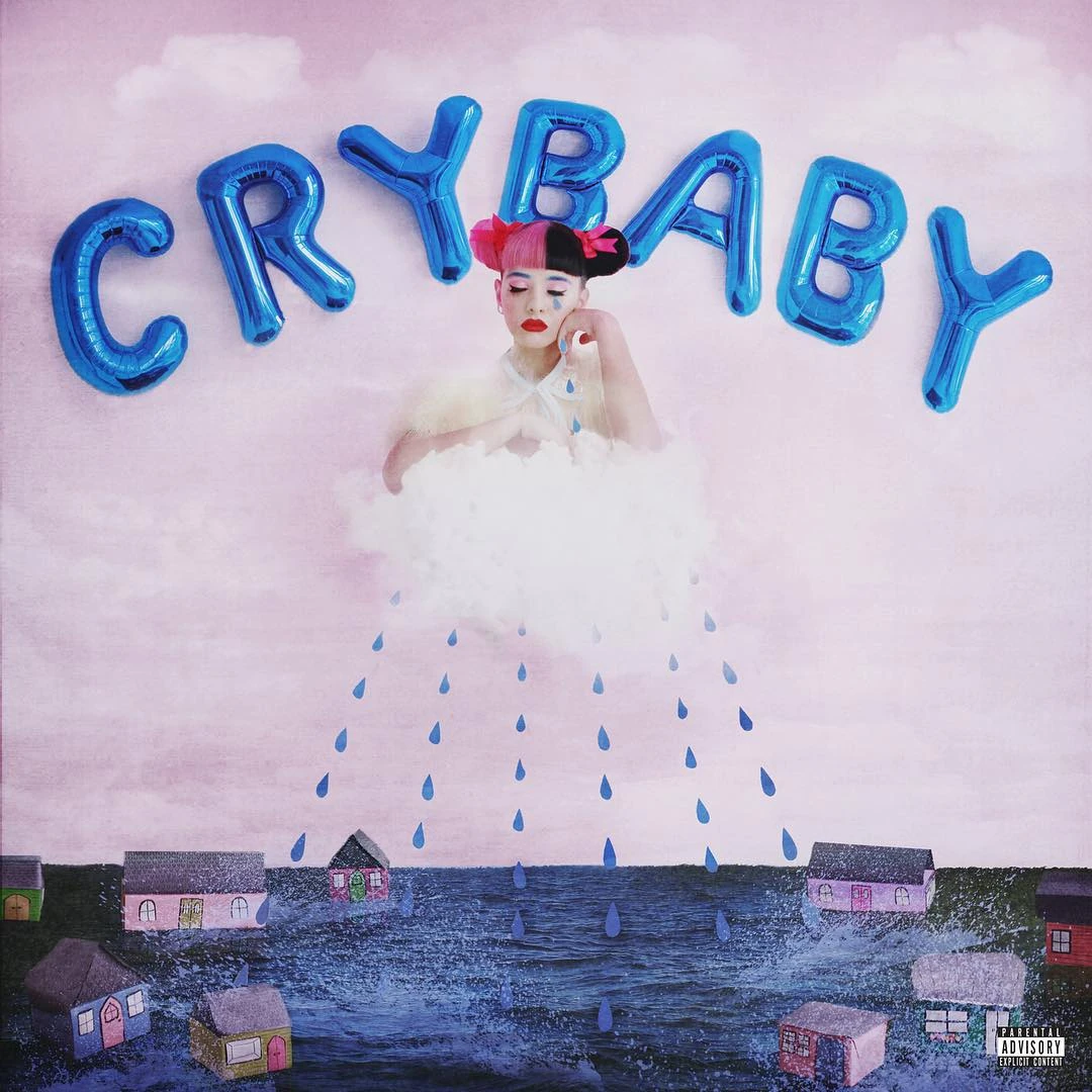 |
| Cry Baby Album Cover |


I also created an illustration of a birthday cupcake and candle to use in the editor's letter as well as some hand rendered lettering for The Art Child title.

Above are my experiments for the 7 Healthy Snacks illustrations. I started off by drawing the snacks (in this case the Nakd bar) but felt something wasn't quite right. Instead I went for watercolour versions of some of the brand logos which I think will be really interesting on the spread. Again, like the beauty survival kit, I didn't want to illustrate all of the products mentioned as I want the images to decorate the article rather than be the main focus.

Eventually I just drew a pencil outline and painted it in stages. To be honest, I'm not overly happy with the illustration. It isn't of the quality I was hoping for and I didn't get to spend as much time on it as I wanted. However, I think that the rough-round-the-edges style MIGHT work for my style of magazine. I'm going to try and digitally edit it and see if I can make it look a bit more polished.
(I also had trouble scanning it but will work around this too).
I'm going to be editing all of the illustrations digitally just to intensify the saturation and again make them a bit more polished (getting rid of pencil lines etc). Overall I am mostly happy with the illustrations.

No comments